Foodna United Co.
Branding
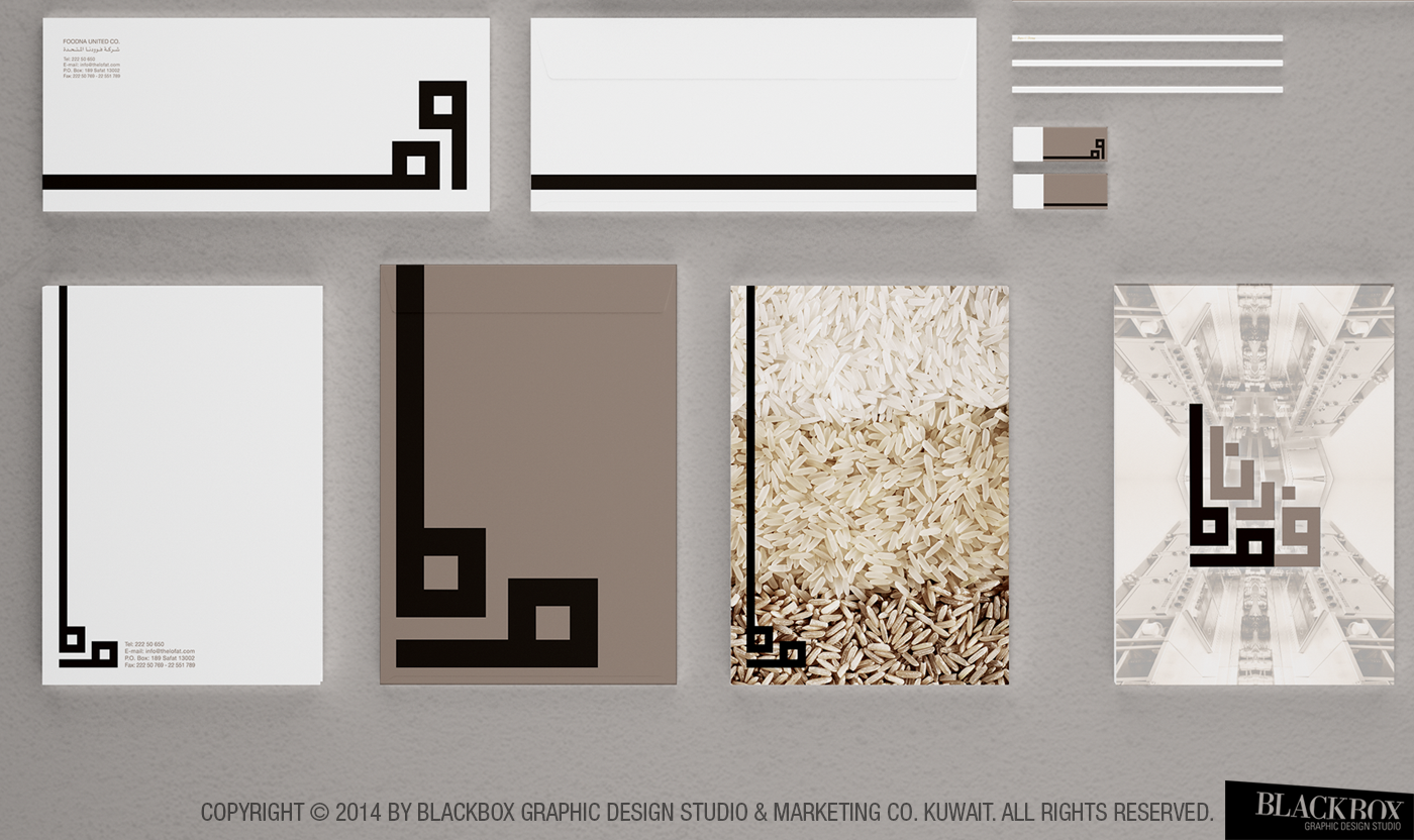
A leading mother company for restaurant chains and a central kitchen certified with ISO 22000, approached us for a complete rebrand to align with the Kuwaiti and GCC market. Our task was to create a new logo, corporate design, and comprehensive brand guidelines, including applications across various print media.
The brief called for a brand identity that embodies both traditional Kuwaiti culture and modernity, while also being fitting for a prominent parent company in Kuwait.
We designed the logo in a Square Modern Kufi style of Arabic calligraphy, using black as the base color to symbolize the traditional black tent, which was historically the master tent in Kuwaiti culture. The accompanying brown sand color represents the Kuwaiti desert, tying the design to the region’s rich heritage. This blend of modern and traditional elements reflects the company’s values and its position in the evolving market.


